|
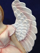
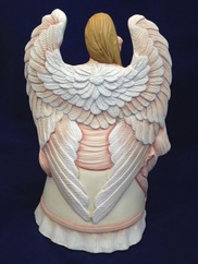
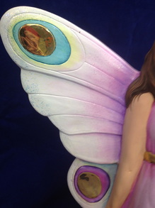
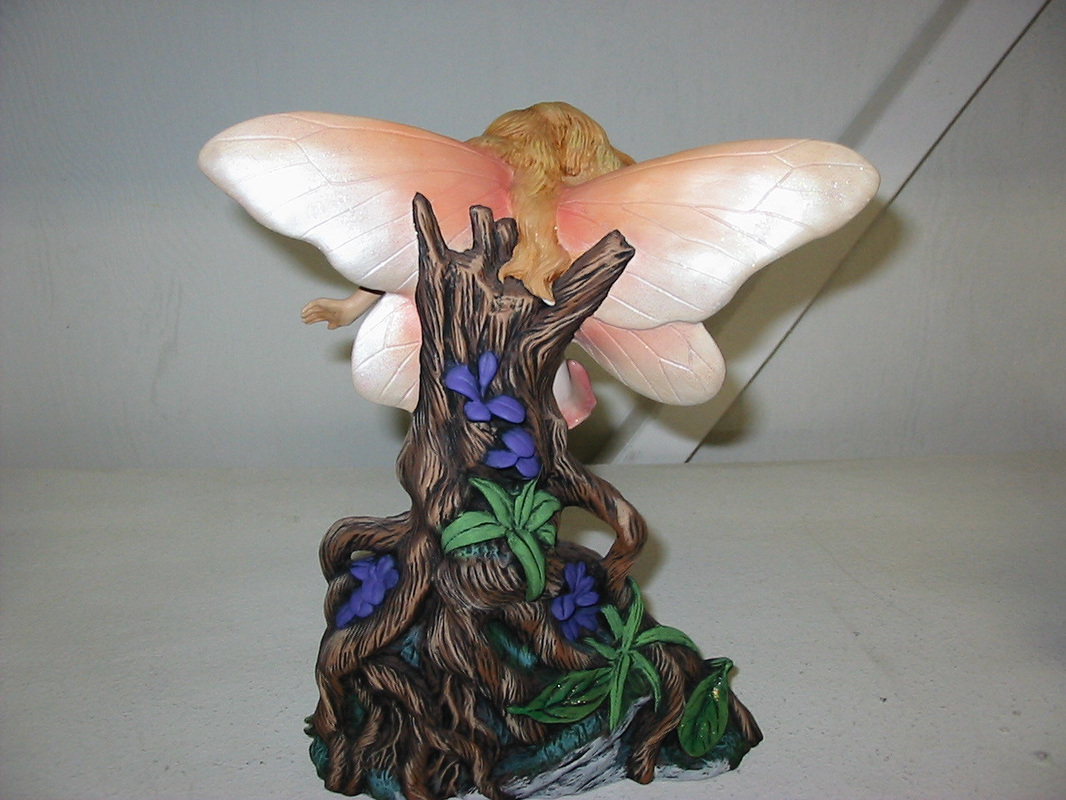
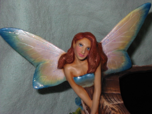
It's important to clean your glass of any cut markings or fingerprints, oil residue etc., before you begin painting. There are a lot of great tips on the Internet on products to use to clean your glass from water to vinegar and alcohol. White vinegar works well to remove all finger prints and residue without leaving a streaky film. I also like to use 70% Isopropyl alcohol spray from Walgreens. Quick and easy, spray on a lint free towel and clean your glass. I have never had any firing residue problems with this product. 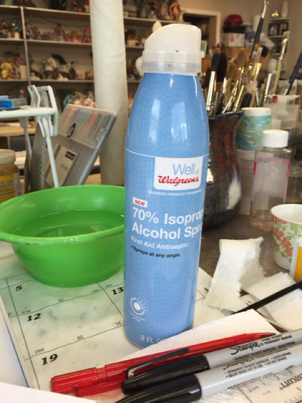 I also like to use this handy paint palette from Hobby lobby loaded with the individual paint containers with colors I am going to use for my project. You can print labels to put on the containers. (puttibg labels on the top and bottom assures you get the lid on the right container during clean up.) 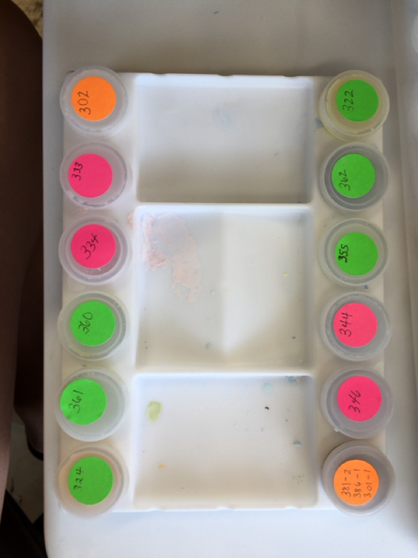 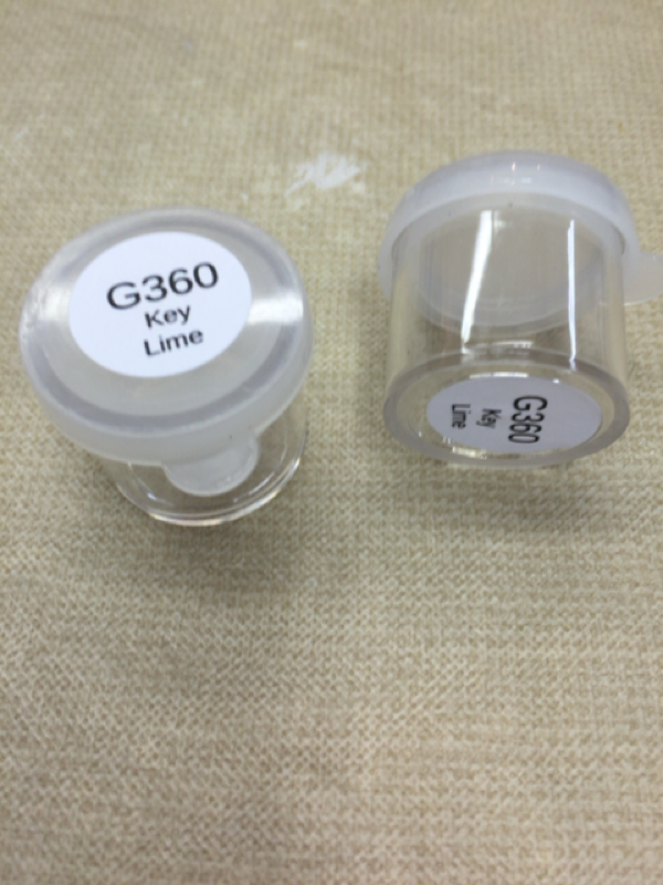 It's best to paint on a light box so you can see the opacity of your colors as you are painting, they run between $ 60 and $150. If you can't afford a light tracing box, a Tupperware box with the pushbutton light works as a pretty decent substitute. Got the box at the dollar store and the light for $4 at Bed Bath and Beyond. Be sure it is a nine LED light, as the single lights dont spread enough light under your project. Just place bix upside down over the light and place the project on top. Move the box around as needed to get light where you need it. 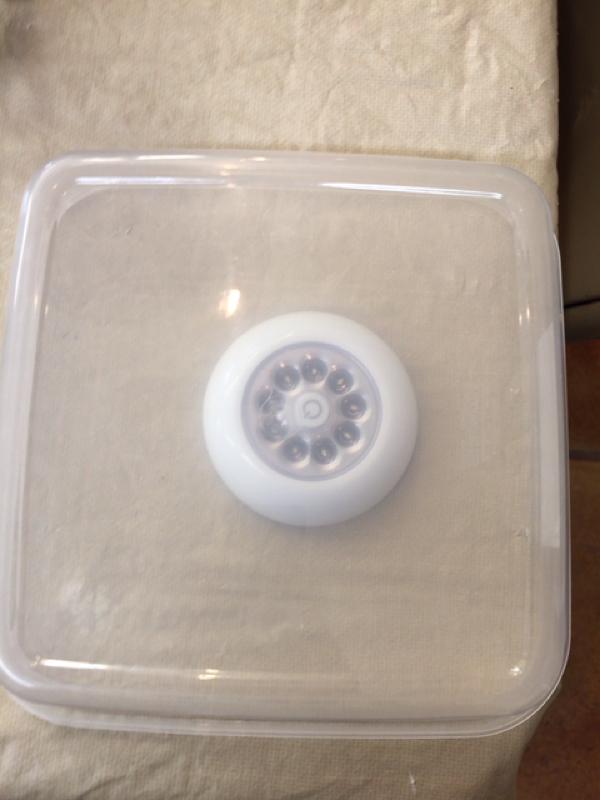 Question today from Jean from Tucson: How do I paint Angel wings, (with texture like Doc Holliday Indian Angels)? Answer: Hi Jean, There are many answers to this question, here is one of my favorite non fired techniques for wings.
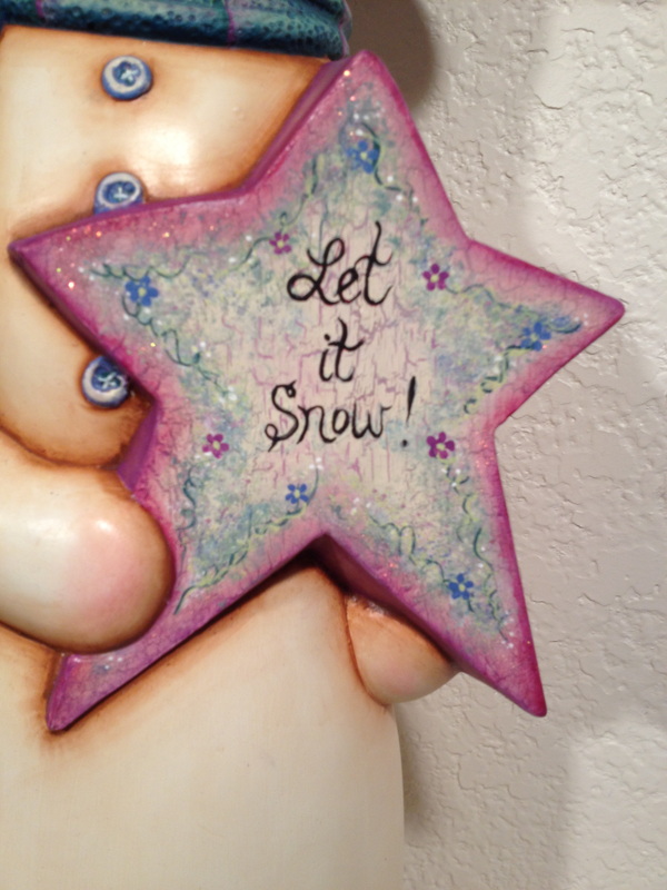
Putting text on things can be intimidating. Here are a few options and tips that help me.
Options: Many options listed below that may work for text. There is a lot of information on the internet about how to use each specifically. Carving:
Stamps: – use a stamp to apply the color on greenware / bisque / glass using fired or non fired products. Coat stamp with acrylic or underglaze color for text using a brush or sponge, then firmly press stamp on smooth area of piece and carefully lift off.) Stencils – use them to airbrush, sponge or trace with on greenware / bisque / glass, with fired or non fired products. Screen Print – purchase a pre made screen or create your own, variety of options to apply on any surface. Easier than you think you can do it at home. (kits available through Colors For Earth) Scratching text - in with a scraffito tool through underglaze / glass color (done by removing the color) on greenware / bisque / glass Baked on Sharpie - on glaze, (bake at 425 in home oven 30 min) or on acrylic surface. Tracing images / text on your piece: Use Contact paper, Carbon paper or tissues paper. https://www.youtube.com/watch?v=JaHDNOCnGqQ Underglaze Options:
Free Hand: I almost always just paint free hand, and occasionally use a stamp if it's a specific /cute text or logo, picture etc. I have used a decal when it's a quote or verse or large amount of text. See tips below for help. Tips: - I measure the area to determine size and placement - do I want it all in a straight line, broken into two lines, angled or straight, centered etc. - I always write it out first on paper to see first to see how it will look. You can even put a little of your base coat color on the paper itself and when dry - experiment with different colors of text and styles of text - printing, cursive etc. You can cut this out and lay on your piece if you need more help visualizing what it will look like on your piece. - When working with Non fired products like acrylics I Prep the area. If I put a lot of work into the base area under the writing, I don't want to have to redo it if I make a mistake with a letter, so I will usually prep that area first to be sure it's easily wipeable. Flat paint - like just an acrylic base coat will immediatly absorb any paint put over it, so it can not be wiped off - you usually have to repaint and usually it takes a couple of coats if you are writing dark text over a light base and this can then become lumpy. So, to avoid this, I will either - 1. Antique the area. Depending on what you are working on, antiquing the surface will not only create a cool shaded look, but it will also seal that area. The oil in the antique naturally repels acrylic "water based" paints, so until the paint has completely dried and "set" it will wipe off very easily. I use damp paper towel and if the color appears to be smearing or not removing clean, a wet wipe will usually do the trick and it doesn't bother the antiqued base area underneath unless you use a forceful scrubbing motion, which isn't necessary. Once you are done, spray your piece and that will seal the acrylic text over any oil based antique to keep it from scratching off. I have never had any problems with this. 2. You can also Lightly spray the area with Matte Spray and allow it to dry before writing on it if you don't want the antiqued look. This seals the surface making it easy to wipe off. Then spray again to see letters. When working with fired products - I try to think through the fact that I will be putting text in an area and realize that I may need to wipe letters off- and how that will impact the area below. If mistakes are a fear, You might consider firing an underglaze area on first before painting text on so text can wipe off with damp sponge if needed without messing up base because it's already fired. Then finally when I am ready to apply the text: - Guide Lines: If needed to keep the writing straight or measured in a certain space, I will draw on any guide lines (bottom guide, height mark or start and stop marks) that might help with a water color fine tip marker. (You can get these from the office supply store, we use these to apply patterns on. Looks like a sharpie, but this marker will wash off easily with damp rag or completely fire out in the kiln.) For acrylics, wash the line off once your painted text is dry. Be sure you paint the text with something that will not wipe off - don't use a translucent. If you are using fired products, the water color marker will fire off without leaving residue. Sometimes I even draw on the text with the water color marker to see how it will look and get it exactly as I want it to use as a guide. Then I paint over the top of it with my acrylic, sharpie etc. - Decide what you will use to write / paint the text on with. You can use a sharpie marker if appropriate for your area, they come in all colors, but remember they are permanent - so you can't wipe them off if you make a mistake If you are very quick you may be able to get it off over a prepared surface, but keep in mind that this could be a problem. (But if you drew your text on with a washable marker first and you are simply tracing now with your sharpie to make it permanent, there may be less chance of making a mistake. I use my 10/0 liner loaded with paint slightly thinned with water which makes it flow more easily. Longer liners hold more paint and can help the text flow more smoothly, but can tend to get away from you and the tip can flip if you are not used to using this type of brush, so a shorter liner may be a better choice for you. Another great brush to use is the Kala Ultimate Scroller. (Get this from Colors For Earth) This is an amazing brush and has a tuft of squirrel hair in the top near the ferrule that acts as a reservoir, holding extra paint so you can write longer without picking up your line to reload your brush. They use this type of brush to detail scroll work on cars. Hope that helps, Happy Painting! Shelley Looking for a great fast finish & festive look for your upcoming holiday pieces? Have lots of gifts to make and not enough time? Try antiquing with Color! Blues & Teal are beautiful winter colors and applying them as an antique creates a stunning effect in minutes. I used to do many holiday craft shows and had great success with lighted scenes, villages, churches, trees and more painted this way and because they were beautiful and fast to paint, I sold many! I had several different shade options and they sold like hotcakes! Especially nice for villages and scenery that could otherwise be tedious and these are very festive and beautiful when lit. 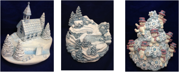 It's Quick & easy.
1. Simply base coat the piece in a light color - white is perfect, but you can branch out and try other pastel shades like light gray, powder blue, etc. and get many different looks. 2. Paint on your antique and wipe it off with a clean dry rag or soft paper towel like Viva. 3. Highlight - If using an oil based antique (which I prefer, you can wipe back further while still damp, with a little mineral spirits on a rag or soft paper towel for additional highlight on areas like snow, windows, etc. Also use this to wipe back any streaky areas and to clean your brush. If you are using a water based product you can use water on your towel the same way. Oil wipes off smoother in my opinion but if you are using a water based product just be sure to paint smaller areas and wipe each off while they are pretty wet before moving on. I wiped the snowflakes on the tree pictured above almost back to white to add highlight and contrast from the rest of the tree. The two scenes pictured - all the snow was wiped back Also use this to remove any streaks or uneven areas and to clean your brush. If you are using a water based product you can do this with water on your towel. 4. Shading - you can shade in some darker areas like rivers, mountains, trees, roof tops etc with darker shades of blue or teal or even a little green as long as it is in a matching shade. You can do this with any translucent product (Paintstiks, Fashenhues, Kimple Intense translucents, Even use a wash of acrylics or chalk if you allow any oil based antique product to dry completely first.) I used Blue PaintStiks in the river of the church scene and just applied the antique a little heavier to the trees in the middle scene. I added pink hats and scarfs with acrylics to the tree on the right just to give some accents. On the middle scene, I would usually add a teal green to the trees and various shades of darker blue to the buildings - not a lot, just enough to give it some interest. If you want to know more about using Translucents I have a "How to Use Translucents (or Fashenhues) Technique Downloadable PDF Packet and "How To Use PaintStiks (Oil Sticks) in my online store. Both product lines are great to use with this technique. Take a look! 5. Embellish & Accent - Spray your piece with a matte sealer, then Add No fire Snow and glitter for final touches to create further bright white contrast and and texture with the snow, and glitz with the glitter. (I always spray before glitter so it doesn't dull the shine.) You can put the clean multi color diamond glitter on the whole thing, or just on the snow areas. You can also use other colored glitters like blue, gold and silver and green to accent. The tree has gold and turquoise glitters on the snowflakes. The scene on the left has a fine diamond glitter on everything, which doesn't show up well in the picture, but is beautiful in person. The middle scene has no fire snow and glitter on the snow areas. You can even add some pearl white or pearl blue in areas to spruce it up. Have fun and experiment! Depending not the piece, add light and maybe bulbs or glue on a ribbon or add a holiday floral pick from the craft store and walah! you have a beautiful piece that was fast and easy! If you are a crafter, this is a money making technique. Oil based translucent stains used to be plentiful and many companies had a variety of color options, but now are a little more challenging to find. Kimple's Shimmering Blue Paste antique is one of my favorites to use as it has little flecks of sparkle in it. Dona makes a great Blue antique. Doc Holliday makes a product called "Antique It". You can mix this 50/50 with any acrylic to turn it into an antique or less acrylic to keep the shade more translucent. I prefer oil based antiques because they wipe off smoother and cleaner, but if you can't find the color you want this is a great option. Just be sure to only paint a small area at a time wiping each section off while it's still very wet. Oil based products are becoming more and more difficult to find, so keeping some of this Specialty product on hand is a great idea. Other colors work great as well. I have a nice plum color which works great at Valentines and I have used it for Christmas and easter as well. Have fun experimenting & Happy Painting! 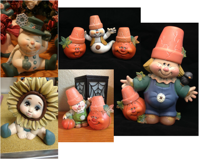 Antiquing is a very versatile product that helps us create many different effects. It should be applied over an acrylic base coat (which acts as a sealer and stops the antique from soaking into the bisque), and then wiped off with a paper towel or soft rag (like a t-shirt), leaving it only in the crevices. Oil base antiques in my opinion are the most effective and clean up is done with a mineral spirit product (there are other options). There are also water based antiques, these clean up with water but do not wipe off as smoothly or as evenly and do not give the same satiny finish.
It can several purposes, I'll just name a few: 1. By leaving a little of the antique behind in the cracks and crevice detail, it can create depth, shadow (and contrast if the antique is quite a bit darker than the base coat). 2. It would also camouflage uneven or messy lines and borders left behind by shaky hands. 3. The antique would change the shade of the acrylics. Using different colors of antique over different colors of acrylics can create many options for shading. For example, If you wanted a nice leather look, you can paint a tan base coat on, which alone, is pale and flat and all one shade leaving it very uninteresting and not very authentic for leather, but by antiquing it with a rich brown you transform it to a darker shade, creating a basic leather or wood look. It can also tone down a bright shade, which can be a negative if you are not aware of that before starting. 4. It changes the texture and finish of the piece from matte and rough to smooth and satiny. Painting antique ON TOP of your final colors: Years ago the most common use for antique was just to paint your piece the individual colors of acrylics you want on each area (skin, hair, hat, shoes, coat, etc) and then paint antique over the top of your piece after it dries and wiping it down, spraying it with sealer and calling it good. However, there are many different ways to incorporate antiques into your painted pieces. I don't normally use this method for an entire piece, but I do use it for things like skin tone, leather, wood etc. Small areas on a piece that can just be antiqued and look fine being left alone after that. Painting antique UNDERNEATH your final colors: I rarely ever use antique as the final finish for an entire piece. Most of the time I use the antique in the middle of the process, after initial base coating, but with full intentions of painting something over the top of it to be my final finish. I may base coat with primer and use antique to get depth, then use translucents' to give color and final finish. I may base coat with all one color or multiple colors, then antique to get depth and a satiny finish to use PaintStiks for color and final finish. I may base coat and use antique to get depth, then wet brush or dry brush to get texture and change color. And sometimes, I amy base coat a piece (could be all one color or each area different according to piece) and the antique to get depth, then paint with acrylics again on the top. One such example is what I call "Reverse Antiquing" as shown in the pictures above. These were all base coated with a light gray and antiqued with black (with the exception of the snowman, which was base coated light gray but antiqued with a dark teal and the terra-cotta pots on the other pieces were base coated with a terra-cotta color and antiqued with white). Then I used acrylics, thinned with water slightly, and loaded onto soft blended hair taklon brushes (mostly flat shaders). I painted each area the color I wanted it to be keeping the color thin and slightly "see through" so the black crevices in the detail areas would show through. I used a swiping back and forth motion to get the color to apply thin and even, and then move on, not retouching an area it as it starts to dry - or you will just remove it and gouge a hole in your color. I did not take the color clear to the edge, I left the dark crevices showing and when possible, angling my brush so the acrylic paint floated over the top of crevices so the paint didn't go down into the detail. Be sure the brush is not loaded so full that the paint is dripping and running or the paint will run into the crevices. If you have an area that is streaky. Let the first coat dry, then swipe over it lightly again to even it out. Some areas, will just look solid, like the snowman's hat and shoes, but that's okay those are smooth areas without any detail to show through. The buttons, I did just paint solid - but the overall piece still has the soft effect. This is similar to how you would apply translucents' - but the difference is in the finish - the translucents' will look see though every where - using acrylics with this method, the colors look for the most part solid, but the cracks shows through. Why wouldn't you just paint the colors on and antique with black on top of it? You could, but the colors will all be dull and dark because the black will change the shade of each color it goes over. This method keeps the colors bright and clean looking as opposed to dull somewhat dingy. This method gives it a little softer look while keeping the colors as bright as you want. I hope this helps a little and gives you some courage to try something new! Feel free to comment here or ask questions and I will give you as much detail as I can to help you be successful! Happy Painting! Question submitted by Robyn: I have a bunch of Smiley statues and have no idea how to start painting them. I know it should be easy, just paint them! but there must be a order skin first then clothes ? What color do I base coat, how do I get shadows, antiquing etc.? Hi Robyn, Regarding the Smileys:
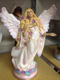
Basecoat: When I decide on base coats for a piece, it will depend on the technique I am going to use. For instance if i am using a translucent product, i will basecoat with something light and antique to get shading and depth and seal over the flat surface of the acrylic to get a smooth surface. If I am Wet Brusing or Dry Brushing I will basecoat with a darker color than my intended finish to keep the crevices dark. Order: I usually paint with these order ideas in mind. 1. lightest to darkest, so that I can be sloppy with the first light color - knowing that the next darker color with cover it up. Then I only have to be care with the darker color when I am butting it up against a border area that is already painted. 2. If I am going to antique one area, but not others, I will base coat and antique that area and let it dry a little before I base coat other areas to be sure they stay clean. 3. Shading and detail is always last - I will come back and use various methods like washes, corner loading, PaintStiks, Chalks etc to add shading in crevices and other areas as needed. Then I will use my liner and do all fine detail like stitching, buttons, writing any text on, outlining any areas that look a little messy and finally the eyes. Skin: Depending on how dark you want the skin, a good medium color for skin is Doc Holliday's soft brown but there are plenty of other choices, some a little pinker, some a little darker or lighter, depending on what look you are trying to get. I like to antique the the skin, Once the acrylic is dry you paint the antique over it and wipe it off. It creates a smooth soft appearance. You can use odorless mineral spirits on a paper towel to wipe the antique off further until you get the skin as smooth and clean as you want. Leaving on the traces of antuque in the crevices, but even though you wiped most of it off. Soft Brown acrylic base coat with Doc Holliday's Soft Brown Antique over it is a nice choice. There are lots of good combinations. You can add shading to the skin over the antique to get your mouth color, cheeks, etc. Chalks (or Paintstiks) work great for this and a rose color acrylic mixed with your skin base coat color always works nice for the mouth line. Most Smileys are smooth (rather than having a lot of detail like an animal fur) so for me, I most likely would choose to paint each area (clothing, skin, hair etc) the color I want in the finished product and I would shade the edges of each section with a darker shade of that color with Corner loading to give depth and maybe wet brush any raised area (like the hair) to add further interest or highlights. I would antique the skin, and possibly the hair depending on texture and color I choose and maybe wet brush the hair if it had a lot of raised detail. Each piece is different, so I can't really give you a one size fits all method. But definitely, I would finish with a large bright expressive eye with lots of detail - that's the best part about painting smilies! If you want any specific help, one on one sessions are available and easy. I can give you individual suggestions for color, technique, method and order, etc. for any piece you want a little extra help with. Or just need help learning how to use a specific product. Hope that helps! Happy Painting! 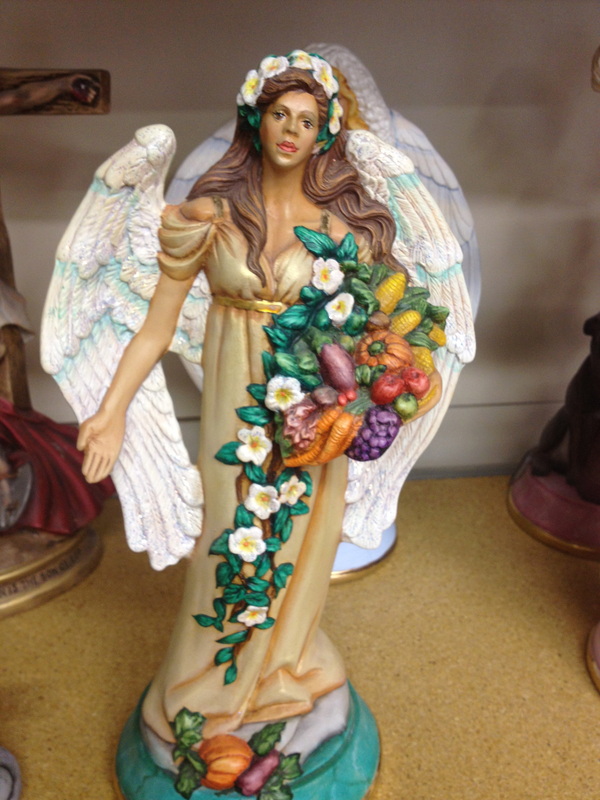 Doc Holliday's Fall Angel Doc Holliday's Fall Angel I have found that the pieces I have enjoyed painting the most, and was the most pleased with the finish, were those that I combined several products and techniques. I love love to paint with acrylics, but I have found that adding a type of translucent paint with my acrylics makes my piece stand out. As well as adding even a small section with a specialty product like Crackle or a specialty technique like marbling makes a big impact on the outcome. This fall angel has wet brushing, antiquing, intense translucence and marbling as well as a little band of fired gold.
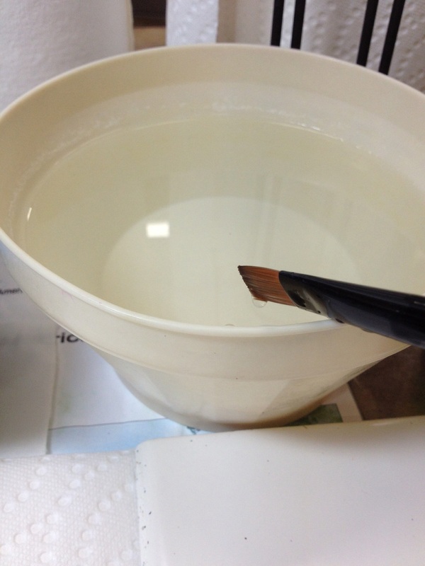
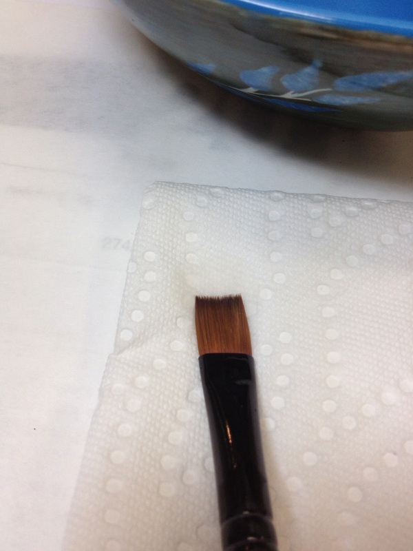
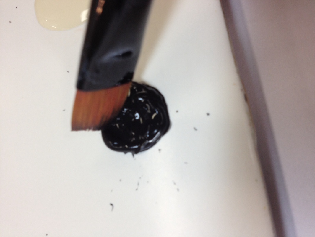
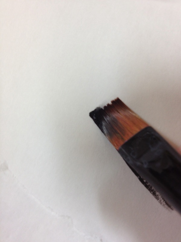
I have added several new How to Technique Packets to my online store as well as a few new Project packets for halloween. The "how to" packets teach the techniques. The project packets contain instructions to complete specific pieces. Several of this project packets combine multiple techniques. Tips & How to's for Corner Loading (CL): using a Flat square shader, dip your brush in water, tap on the side of the bowl to get drips off handle and bristles, then lay brush flat and press very quickly on paper towel, turn the brush over and press the other side quickly again, this just bleeds out excess moisture but not too much we need water in this brush. Using the same corner each time you load with paint will help you avoid having left over color in the side you thought was clean. My method for this is to load With the letter side (brush company writing on the handle) facing up. Dip just the corner of your brush in fresh paint (I prefer Doc Holliday Acrylics, use a darker color than the area you are shading) then holding your brush at a slight angle touch the full brush down on scratch paper (both corners and all surface of brush) using pressure to flatten and bend the bristles, and stroke against the paper to get the water in one corner blending with the paint in the other corner until the mark left on your paper is a smooth blend going from a crisp clean solid edge of paint on one side fading to nothing, leaving no hard line on the other side. If you press on the paper and water pools, you have too much water or you're pressing too hard. If your stroke is scratchy and sparse, you don't have enough water. Keep trying until your stroke is correct. Once you have it down on paper go to your piece. When painting reload often and work quickly to smooth out any imperfections before the paint dries. You don't want hard start and stop marks on your piece. Use this technique to shade crevice detail, define and outline border areas. The pictures show the steps  You can create beautiful backgrounds and finishes with a sponge! Using a clean, damp Sea Wool Sponge (look for one with lots of interesting larger holes and detail) scrunch up the sponge to have part in your hand as a handle to expose a nice interesting area of the sponge to use as the painter. Dip this painter end of the sponge in 2-3 colors (that have been placed on a tile) so that the head of the sponge you are going to use to paint with has 2-3 separate areas of color – its okay if they overlap. Then using a pouncing & twisting motion, pounce this painter area of the sponge on a scrap paper while using a random twisting motion with your wrist to gently begin blending the colors, then move to your piece. The randomness will keep the sponge prints from looking too symmetrical or patterned (unless that is the look you are after). Using a bit of pressure will expel some of the moisture in the sponge out with the paint causing the colors to blend. Pounce only long enough in one area to provide good coverage while creating interesting detail, then keep moving across the piece. If you over work an area, your colors will blend too much together, creating a single color with smooth detail. To get the full rich benefit of color, contrast and distinct detail, it is important that you keep the sponge moving. Don’t be a perfectionist in this area, allow randomness to create for you, and in the big picture, the things that looked dramatic or “too much” will enhance your piece. Choosing your colors is part of the fun, each combination will yield something creative. Try Coppers and browns, greens and yellows, and varying shades of one color, for instant light blue, dark blue and throw in white for contrast. Be sure to keep a journal of which colors you like best.
Corner Load Shading: This technique is great for creating a shaded border that looks crisp and dark on the outline edge and fades out, similar to arbrushed look. The 1st picture below shows dark blue shading to border the robe, giving it detail, the second picture shows the outer edge of the eye being a darker shade as well as the brown shading around the eye and brow line; the third picture shows an entore scene created with just outlined shading in various colors. Start with a clean square shader, dip in water and tap off excess. Blot this quickly on a a towel to bleed out water and then dip corner of brush only into desired color of paint. Tips for success: Always go to a test paper and press the brush fat and do short strokes applying pressure to see that your brush has the proper amount of water to help blend the color. Performing these short pressured strokes on paper helps pull the paint from the corner of the brush slight over into the square edge of the brush, blending it with the water in the brush. This creates that hard to soft stroke that is so perfect for shading. Always place the hard sharp edge (corner of brush loaded with paint) along the edge you are intending to shade). If the brush stroke is scratchy, you don't have enough water in the brush, if water pools on the paper when you do your test stroke, you have too much water. I am currently working on my "Various Tips How to Technique Packet" which will describe this technique in full detail with pictures of properly loaded brush and test strokes along with how to correctly load and fix mistakes. Hope you are finding time in your week to get a little painting in! God Bless & Happy Painting Shelley 
|
Shelley Long
Ceramic Artist & Teacher 
I will share various tips for painting on this page, I hope you enjoy
them! Please feel free to ask questions or comment, it's always nice to
hear from other painters and I am happy to help any way I can! I will be adding various technique packages to the online store and when I
do I will post an update here to let you know a technique has been
added. Check back soon tips !
God Bless & Happy Painting! Shelley  
Receive Updates
program for scheduling - by BookFresh Categories
All
Archives
March 2016

Back to
|